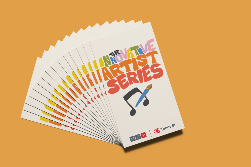
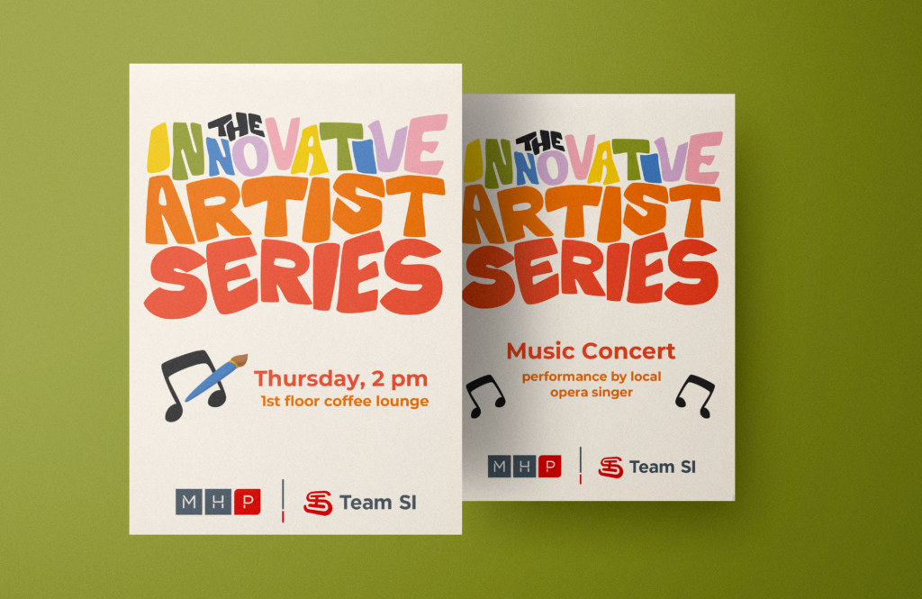
Artist Series Logo
Tasked with developing a logo for an ongoing series of artistic presentations, I embraced the opportunity to create a playful and adaptable design that captures the essence of these informal events. By intertwining hand-drawn lettering with a whimsical color palette, I infused vibrancy into the logo, symbolizing an enlightening summer series.

Dynamic Lettering
With meticulous attention to detail, I sculpted each letter to seamlessly interlock and flow, ensuring effortless legibility and visual harmony as a cohesive logo.
Creative Function
This deliberate approach allows for seamless integration across a range of applications, from signage to promotional materials, without compromising the logo’s versatility and impact.
The outcome results in a captivating design that adapts effortlessly to various mediums and leaving a lasting impression on audiences.

Uncover more Design Inspiration!
If you enjoyed this project, look into my First Friday branding analysis. I expand on my creative strategies for combining colorful and fun designs with strong foundational design work to relate to brief at hand.

