Helvetica
The classic typography poster. Delving into Helvetica’s rich history and understanding its significance served as a catalyst for my own creative process in crafting a unique typography poster.
The Idea
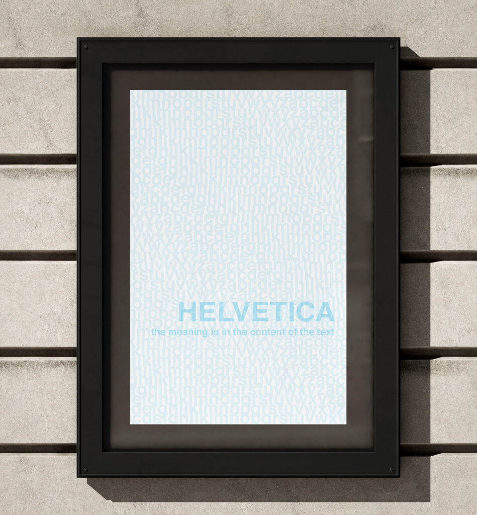
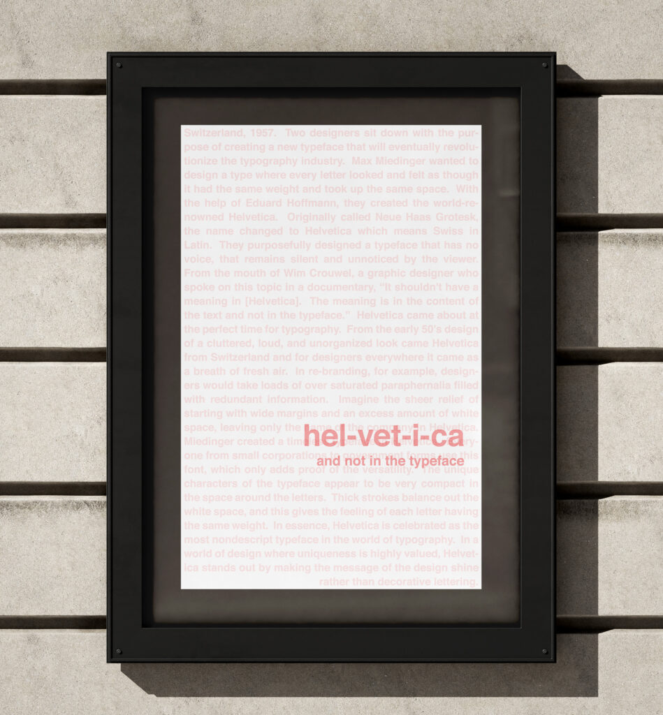
Drawing inspiration from Helvetica’s core principle of being the “invisible typeface,” I found myself captivated by the vision behind its creation. Max Alfons Miedinger, the original designer, was tasked with crafting a font that would later be recognized as Helvetica.
His meticulous approach struck a harmonious balance between the letters and the surrounding white space, resulting in a beautifully poised typeface. The true essence of Helvetica lies in its ability to amplify the power of the message, shifting the focus from the words themselves to the message intended.
The Execution
To enhance the impact of my design, I aimed to cultivate an immersive and interactive experience. By incorporating 3D glasses, the audience can actively engage with the poster. Through the red lens, they perceive only the blue, and vice versa.
This intentional interplay showcases how Helvetica transforms the text and adds simplicity to the design. By involving the audience in this transformative process, the glasses serve as a conduit, rendering the text readable while effectively blocking out all other distractions. It is through this dynamic interaction that the essence of Helvetica comes to life.


Ready to Discover More?
Look no further than my “I AM” honors thesis project. Explore my research in the cultural ties in graphic design, and how different countries work alongside social media trends.