50th ‘Innoversary’ Logo
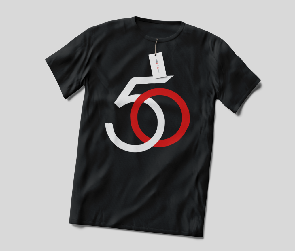
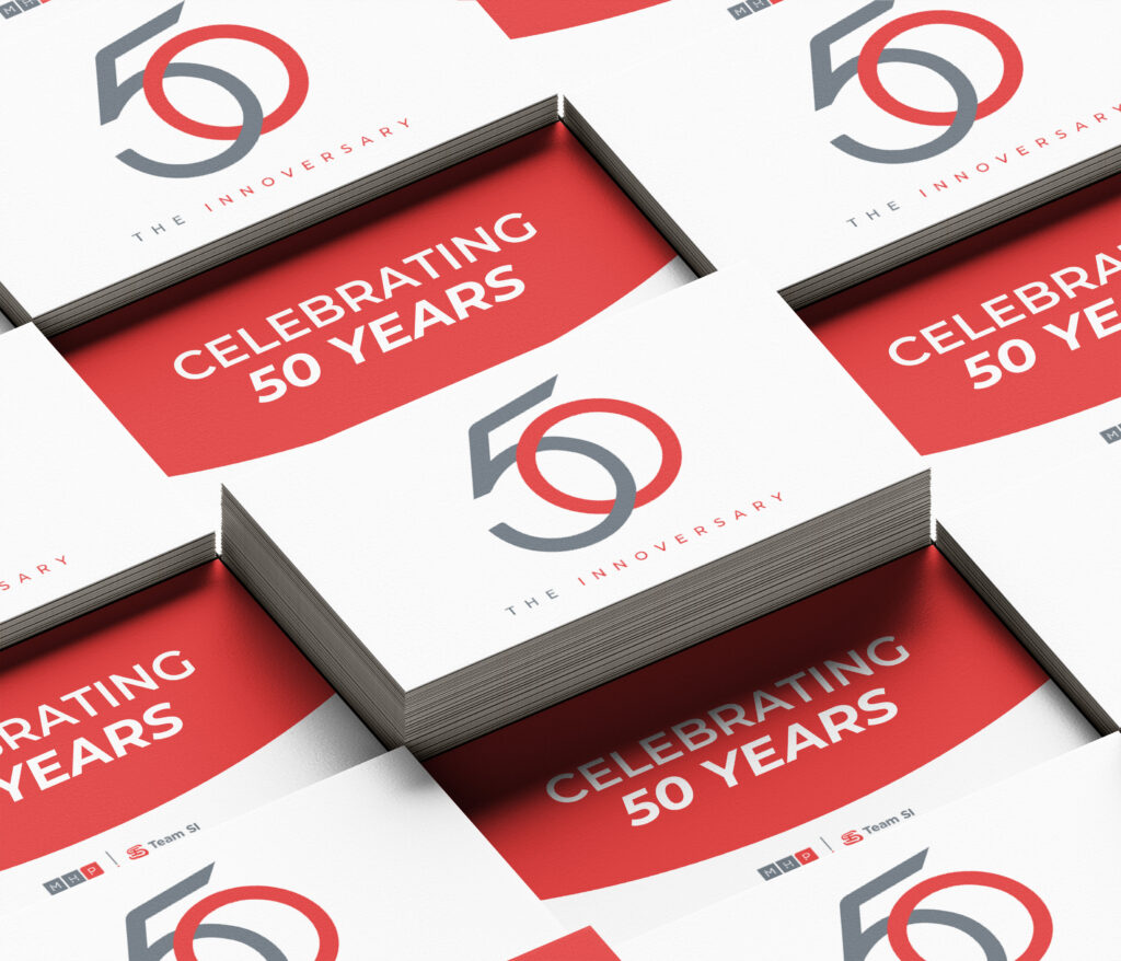
Approached with the task of creating an elegant and iconic 50th anniversary logo, I meticulously crafted the typography with a clever fusion of both numbers. I took inspiration from MHP Team SI’s drive toward innovation and forward-thinking nature, alongside their sleek and classic brand guidelines. A beautiful logo for a dynamic marketing agency.
The Concept
By skillfully intertwining the ‘5’ and ‘0’, the elegant loop formation embodies a timeless fusion. It not only symbolizes MHP Team SI’s commitment to classic design thinking but also embraces a world of limitless possibilities.
The Execution
Meticulously balanced, the design exudes a sense of harmony and precision. Embracing the power of a clean grid layout, each element finds its rightful place, ensuring a seamless visual experience decorated in the brand’s colors.


Want to Explore?
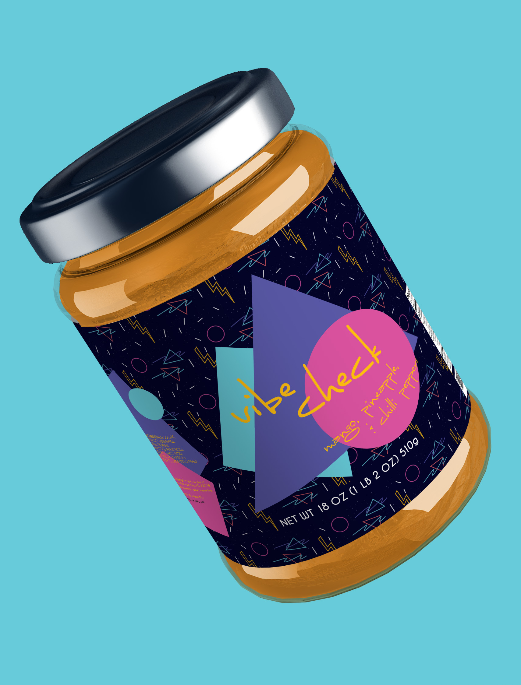
Delve into an older passion project of mine – full of puns and exceptional packaging. Check out Jam Session, a punny jam subscription box, the perfect treat for any tea time lover!

